
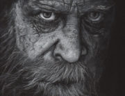

Human and animal portraits are my most commonly requested commissions. Not all portrait artists work the same way or use the same mediums. In my portraiture work I aim for a high level of realism, often photorealism. When viewers look at my portraits, I want it to take them a moment to realize it’s a drawing and not an actual photograph. To achieve this level of realism, I rely heavily on high-quality reference photos. Most of the time, these photos are provided to me by my clients. When we first kick off a project, we spend a little time evaluating photographs to determine if they are good reference material. I’m going to share with you some of the things I look for when choosing great reference photos for portrait drawings. Most reference photos don’t check every box and THAT’S OK! I can take some artistic license and always do. This is a list of ideals intended to be used as a guide for clients. I encourage folks to email me their photos for evaluation before committing to a project. There’s no charge for this and there is no obligation to book a commission. Send several, if you’re not sure. I’m happy to do it. That said, here is a short guide to help you understand the reference photo evaluation process.
Image Quality
Image quality might be the most important consideration when choosing a photo for reference. A small, low resolution image simply can’t provide enough information to adequately reproduce a subject’s likeness. On the occasions I do work from blurry or pixelated images, I’m recreating a historical portrait. In these cases I apply what I’ve learned from studying hundreds of faces but the result may not be truly representative of the subject. If you are intimately familiar with your subject, the portrait may seem inaccurate due to the latitude I’d have to take to complete the piece. In historical portraiture, this doesn’t particularly matter.
When evaluating digital image quality, the photo should be physically large or sufficiently high-resolution. There isn’t a specific rule about size that I can cite because how the subject is photographed makes a difference, but generally speaking…
An image could be 5×7 inches at 300 dpi or 30×40 inches at 72 dpi and work well. A 5×7 at 72 dpi likely will not. Despite what all those crime dramas will have you think, you can’t add resolution to a low-res image. Importing a 5×7 inch (360 x 504 px) 72 dpi image into a computer program and saving it as 300 dpi won’t sharpen your image.


Get Close
My work, specifically, is focused on fine details achieved only with a high-quality, close view. Other artists focus on the body or gestures; I focus on the face and conveyance of emotion. Ideally, the reference photo should be close up. The pores in a person’s face lay out in curving lines around their nose and mouth. It’s helpful to see this. In cats and dogs, the fur grows in specific directional patterns. I draw each hair individually and though they may not be a direct copy from the image, understanding the pattern and direction of growth is helpful. Many of my portraits are so close-up that a portion of the subject is cropped out entirely. This allows the viewer to appreciate the fine detail of the eyes, skin or fur. Not all portraits I draw are super close-up, but generally speaking, are focused within the face, head, neck, and shoulders.


Aspect Ratio
You may or may not know the finished size of the art you want when you first reach out. Size is a factor in cost. Obviously, larger pieces are more expensive. There are specific frame and mat board sizes that are standard and planning your piece to fit into a common size can save a lot of money on expensive custom framing. The reference photo, however, may be a different aspect ratio and, when scaled up, may need cropping. Cell phones, for example, often take photos in very long, 9:16 format, while frame sizes are a more squat 8×10, 9×12 or 16×20. A fair bit of the top and/or bottom would need to be trimmed out of the final piece to fit a common frame. Alternatively, a custom frame size may be required if you prefer to maintain the entire image exactly as it was taken. Visualizing this is difficult, so every portrait project begins with an evaluation of cropping, my recommended layout, and client sign-off before beginning work. Aspect ratio is just something to keep in the back of your mind.

Contrast
Contrast has two parts in the evaluation process.
1. Exposure:
An image that is too bright and blown-out or too dark will lack sufficient detail. I can somewhat compensate for this through the drawing process, but we’d want to avoid extremes.


2. Light and Shadow:
Variation of light and shadow make for more interesting portraits than those that are more evenly lit. A single light source or dramatic shadows can make the piece really stand out. This isn’t necessarily a requirement, but if you have two comparable images and one has a greater range of light and shadow, that may be the one worth choosing.


Visual Interest
Pose can make a good portrait, great. Like shadow, this isn’t a requirement, per se, but is always worth considering. Think about what you want to come through in the portrait. Is it the subject’s personality? Their emotion? Their style or likeness? All of the above?
A few suggestions: A straight-on view may not be the best view. You will often get a better sense of the person’s likeness if they are turned slightly so that you’re seeing a 3/4 view. For dynamic portraiture, consider views from high or low…or who knows, maybe upside-down.


The important thing to remember is this is just a guide. We don’t want to let perfect become the enemy of good enough. If you’re thinking about commissioning a portrait, choose a photo or a few you think represents your subject well and email them over. I can quickly give you feedback.
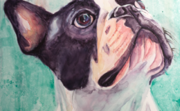
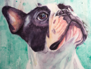
Good Reference Photos
Here are a few more examples of good reference photos and how they translate into a portrait.

Reference by Joanne Duffin Reference by Joanne Duffin